Information
Architecture and
Site Navigation
Luxaflex
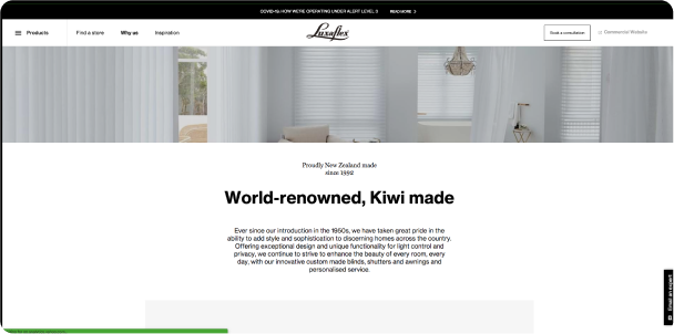
Due for a refresh the Luxaflex website was starting to feel outdated and not fit for purpose. As New Zealand's premium brand in window shades, Luxaflex wanted a fresh new look while still striving to keep their complex product range user-friendly.
CLIENT
New Zealand Window Shades
ROLE
Information Architecture
Wireframing
Navigation System Design
UX Guardianship
Mapping out the current
state of the site
Extensive discovery was done in the early phase of the project to understand the current complexities of the architecture and to uncover any pain points that existed.
Information
Architecture and
Site Navigation
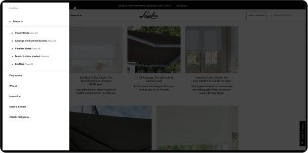
Information Architecture
I experimented with multiple iterations of the information architecture to ensure the correct approach was taken. Included in the build, was a sister-site and a matching commercial website which created intricate crossover.
Complete site
wireframing on
Desktop and Mobile
Clickable
client
prototype
Getting into the details
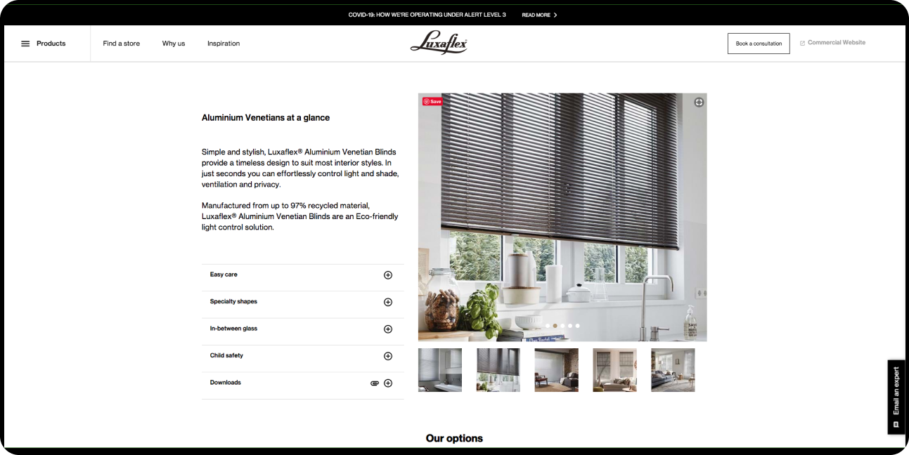
Very granular wireframes to articulate the multiple layers of products, materials, colours and finishes. Clickable prototypes were created for all 3 of the websites for the client to test and feedback on.
UX Design to
Final UI Design


Taking shape
I worked closely with the digital designer when design direction was applied and continued to offer UX guardianship throughout the development phase.
Testimonials
Luxaflex
“Brennan worked consistently well with the User Interface design team to achieve the best end result for the client. He was open to alternative ideas and was willing to reiterate UX models after design discussions with the wider team.”
Testimonials