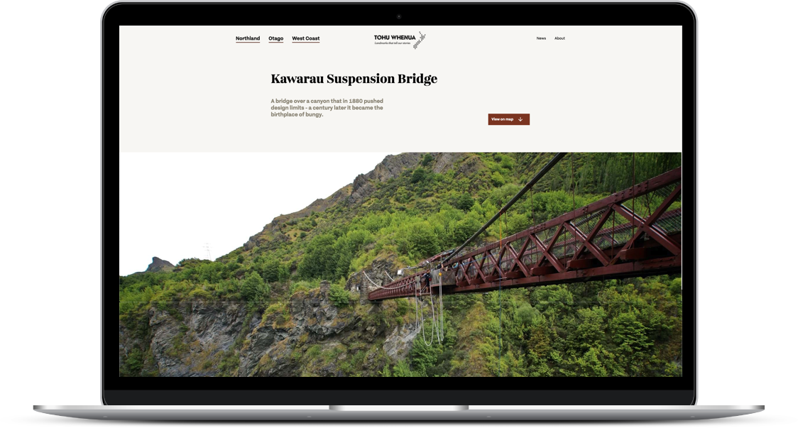
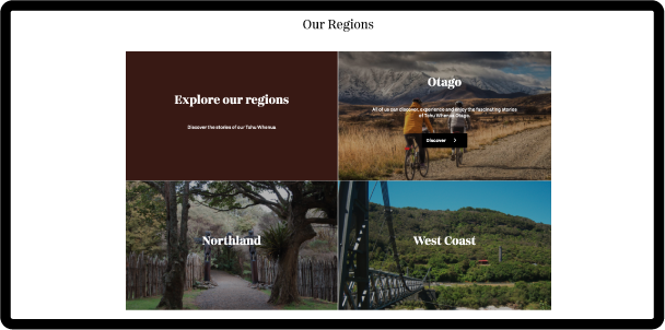
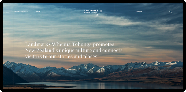
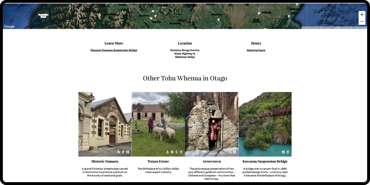
The aim of the Landmarks programme is to promote New Zealand's significant historical and cultural sites and to encourage people to visit these sites. The Landmarks team wanted a new website that would challenge the status quo designs of typical government websites without loosing the unique cultural treatment you would see at the landmarks themselves.
CLIENT
Landmarks - Tohu Whenua
ROLE
Stakeholder Workshops
Content Audit
Information Architecture
Wireframing
Places that tell
our stories
Our first meeting was
in Antrim house,
which is a treat for
anyone interested in
history and architecture.
The team involved in the Tohu Whenua programme were extremely passionate
about its cause and firmly believed in educating people on the places that
captured the defining moments in the story of New Zealand. I had a workshop with
this team to soak up their passion and learn as much as I can about the Landmarks
and the people that visit them.
Content is
king
Information
Architecture and
Site Navigation
Information Architecture
I experimented with multiple iterations of the information
architecture to ensure the correct approach was taken. Included in
the build, was a sister-site and a matching commercial website
which created intricate crossover.
Complete site
wireframing on
Desktop and Mobile
Down to the last detail
The landmarks team was quite specific about the detail that went on
each page so I spent a lot of time making the wireframes quite
granular and content-accurate. Every page for desktop and mobile had
to be prototyped and approved.
UX Design to
Final UI Design


Simplicity meets artistry
We wanted the site to have plenty "breathing space" but still be content-rich
and informative so the design treatment was formed together with the
wireframes to encourage exploration. That design treatment, combined with the
beautiful imagery from landmarks, forged a website that is educative, cultural
and beautiful to look at.